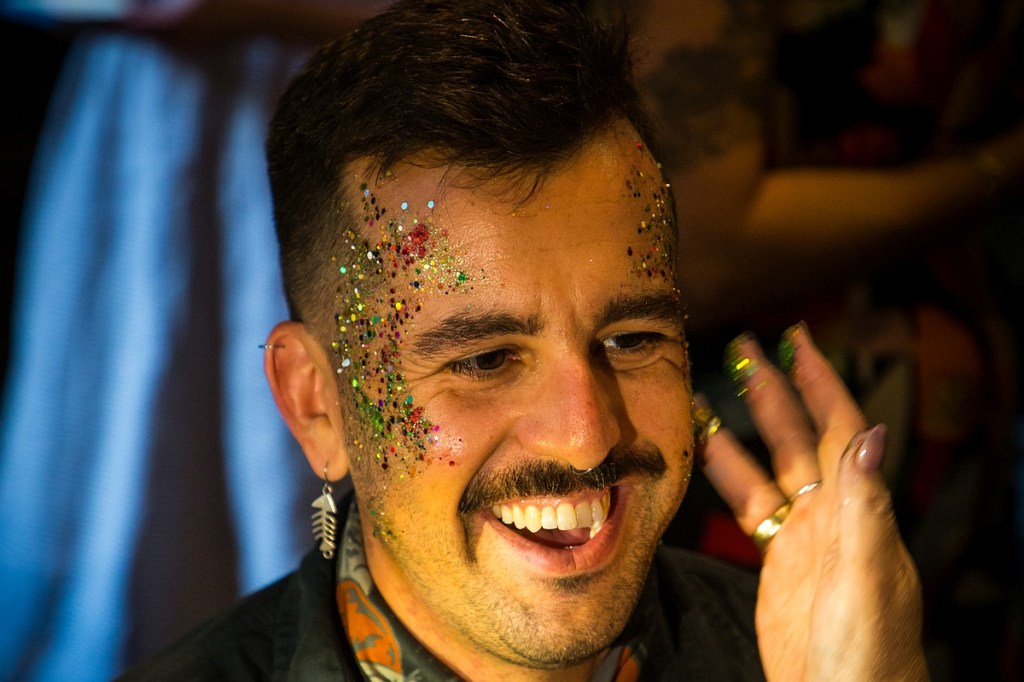
Subjects have consented to their pictures being used here
Gear
Camera: Canon EOS 6D
Lens: Canon EF 24-105mm f/4L IS II
I co-owned a photography business in a previous life, and I now sometimes offer to be second shooter at close friends’ weddings. They get good pictures, it becomes my wedding present, and I get to take pictures with essentially zero pressure while having fun with my friends.
In this vein, I recently shot a wedding celebration. The couple had quietly gotten married and gone on their honeymoon, but later used it as an excuse to throw a big sort-of-reception party. The event was very much in the wonderfully silly vibe of the couple. One part of that was a face painter who just happened to set up right next to a small window that, in tandem with a small lamp under the window, threw nearly perfect light on the people having their faces painted. I turned off my hot shoe flash because I didn’t even need fill.
As guests arrived, I kept an eye on the station and tried to get at least a few pictures of everyone who sat down.
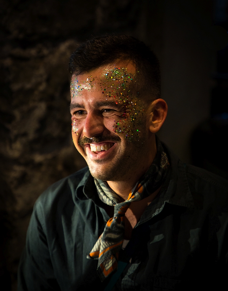
After the planned events (you know, normal wedding reception stuff like pinatas of the bride/groom, a best-dressed competition, and a “splitting the G” competition with glasses of Guinness), the bride headed over to the face painter. The sun had gone down, so the light wasn’t as diffuse, but the lamp was still at a good angle.
I started out with a look similar to what I’d done with the sunlight, but also wanted to play with depth of field by opening the aperture wide (f/4.0), zooming in (90-100mm), and getting small parts of the painter’s hands/body in frame for a bokeh-ish look.
Because the lamp was fairly directional, parts of the subject were “hotter” than others, such as the collar here.
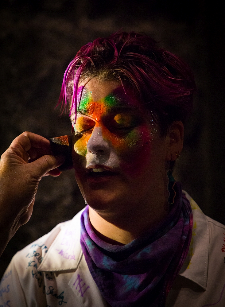
I liked the contrast with the dark background, so I shot decently fast (1/160 shutter speed) and adjusted the hot spots in post by decreasing the highlights and white levels. Not as clean/even as the sunlight coming through the window, but still a good look.
After I got a good set, I figured I’d try out some stuff I wasn’t sure would work. The spot had been magic all night, and if I there was ever a time to experiment, this was it.
I started finding angles where larger and larger portions of her face were blocked. I’ve always liked playing with negative/blank space in close-up portraits, and the painter’s hands and body could continue to give a bokeh-ish look.
When I applied the same settings as the previous shots in post, the pictures were a little more visually interesting, but I wasn’t getting the pop I’d hoped for. Generally, when I want something more from a portrait, cropping close is the first thing I try, and it definitely added intimacy here: the hexagons of the large glitter flakes, the tiny points of light from the glitter, the slight imperfections of the brush strokes.
I wanted to heighten the isolation and focus even more, so I cranked up the contrast enough to turn the background nearly flat black, drawing all attention to the face. Two bonuses of that contrast adjustment:
- It effectively increased the saturation of the face paint colors, further drawing the eye to the areas with the most prominent hues (purple in hair, green on forehead, white/purple on tip of nose).
- The painter’s hands and body became even darker, adding to the contrast between them and the brightly-lit/colorful face.
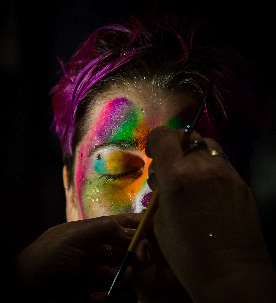
I really liked the combination of the painter’s hands and the bride’s facial expression in this one, but the person in the background was pretty distracting.
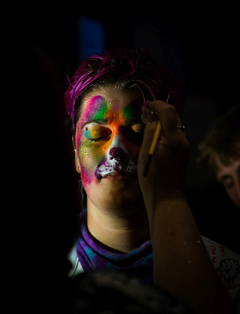
It would have been fairly easy to brush them out since the background was now essentially flat black, but I decided to try cropping it even closer. Doing that with vertical framing wouldn’t be good (a face framed like that is often visually overwhelming), and I have a soft spot for skinny landscape portraits.
Random thought that isn’t based on actual fact: maybe people who remember standard definition TV (4:3 ratio) read landscape facial framing as more dramatic because only movies were shown in widescreen (16:9 and other ratios) back then? Or maybe the empty space on either side of the face is just more dramatic for everyone. Whatever the root is, I really like this:
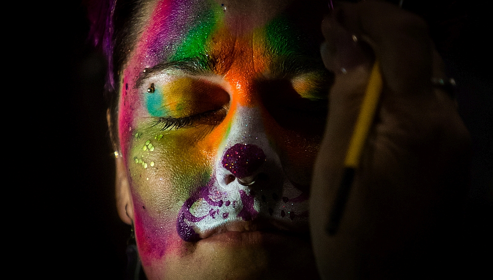
We see just enough of her hair to visualize how the rest of it looks. The facial expression is an intriguing mix of concentration and peace: the lips and cheekbones are relaxed, the brow is just slightly furrowed, and the eyes are something between. With this zoom, we can see the slight variances in the painted dots on her upper lip as well as the flowing/blurry edges of the borders between the color sections. To me, these imperfections make the paint work feel more hand-crafted or…charming? It’s a picture full of gradiation, then the tip of the nose stands as a stark island of royal purple with a fairly sharp line separating it from the white on all sides.
The painter’s hand is just enough out of focus to push one’s eye back to the face, and its close proximity adds to the feeling of intimacy started by the tight framing. This might just be me, but seeing her piercings in so such detail also feels very personal/intimate. The hand blocking the right side of her face introduces some asymmetry and prevents one from simply comparing how the paint looks in light and dark; nearly all the paint we see is bright and vibrant.
This was a surprise picture. Nearly every time I press the shutter button, I have a pretty specific composition in mind, and most of the time, that’s what eventually gets exported and sent to the customer. Of course, unexpected things often force me to make minor changes, but the overall feel usually remains. Of the 324 pictures I delivered for this event, this was the only one whose framing and coloring was significantly different than what I had in mind when I took it.
And without someone randomly leaning into the background of the shot, it’s very unlikely I would have ended up here.
 Evening Latte
Leave a comment